Imma be honest, I judge a book by its cover... AND HERE'S WHY!
When I see an eye-catching book cover it brings me nostalgia. I think back to when I was a kid roaming up and down the aisles of Barnes and Noble looking for a novel that caught my eye. Believe it or not, lil' Shea was actually an AVID reader when she was younger, haha. I remember diving into complex books at a young age just because I wanted to. This was obviously at a time however before rigorous schedules, IB academics, and just the overall STRESS that accompanies growing up came into play! All a kid had to do (in my case) was play tennis religiously, do homework, and read for fun! The simple life (which I'm sure we all miss)!
Anyways, when I would look for a new book to read I would do the only thing a kid with no smartphone/internet could do which was gauge whether the books would be interesting based off of their covers. I was in fact "judging the books by their covers". I didn't have a list that I could pull up on google stating "top 100 famous novels" or whatever in order to tell me which ones were interesting so I'd just roll the dice and see where the covers took me! I distinctly remember going by the adult novels section and seeing a book that stopped me dead in my tracks. I reached up and grabbed the book with enchantment in my eyes... 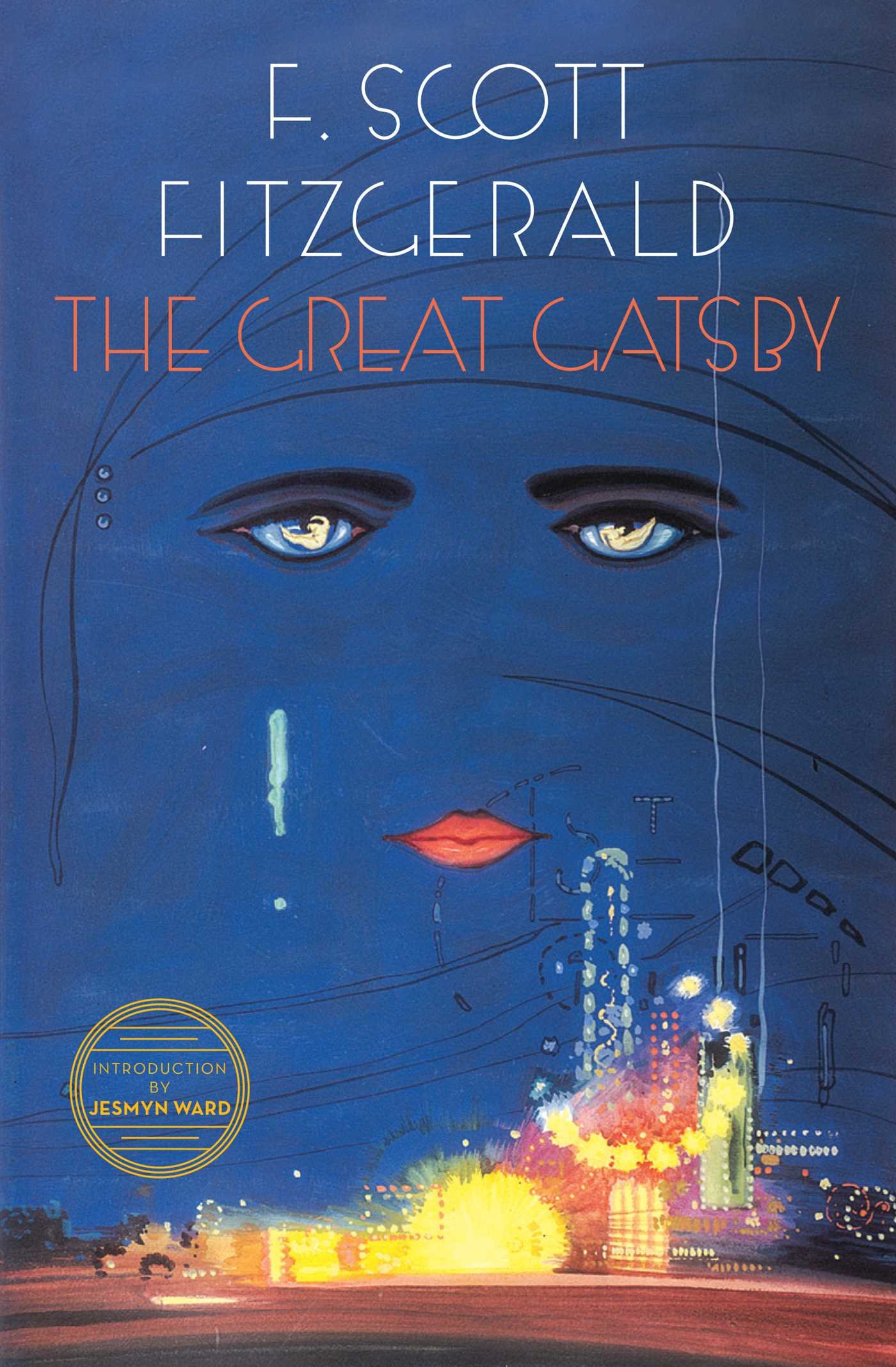
Now at the time, 11 year old me found this book cover SO cool! It intrigued me so much once I saw the bright colors and looked at the hidden face in the middle of the page (most notably, the face's eyes). I didn't even know the difficulty level of the book yet but I just knew I wanted to read it! I read this book within 3 days and loved it. After reading the book I came to appreciate the cover even more as the cover actually coincided with the book's plot. For those of you that haven't read it yet, in the Great Gatsby, there is a billboard on the outskirts of the city in "the junkyard" sector that shows an image of an oculist's eyes (-->Dr. T.J. Eckleburg). This billboard is reoccurring in the novel and "watches over" the climactic moments that take place.
“The eyes of Doctor T. J. Eckleburg are blue and gigantic — their irises are one yard high. They look out of no face, but, instead, from a pair of enormous yellow spectacles which pass over a nonexistent nose. Evidently, some wild wag of an oculist set them there to fatten his practice in the borough of Queens, and then sank down himself into eternal blindness, or forgot them and moved away. But his eyes, dimmed a little by many paintless days, under sun and rain, brood on over the solemn dumping ground.”
To this day The Great Gatsby is one of my favorite books and this is all thanks to its cover. As my final point, I feel that book covers play a major role in first off, getting a reader's interest in order for them to actually pick up the book, and second, I think that a cover can play a vital role in revealing key plot elements of a book. I feel like successful novels typically have an eye-catching cover that may later reveal to be connected to the contents within them. The counter to this, however, is when covers have completely nothing to do with the plot of the book which (in my opinion) is baffling, yet an odd and intriguing notion because then the reader is challenged with the task of finding out why the author/editor made this decision...
Now that I've given you my opinion when it comes to covers, let's see some cover depictions of "Never Let Me Go"...
Words: Colorful, Childhood. Plot guess: Story about growing up; Family story.
 Like The Great Gatsby cover, this one intrigued me because of the colors. I also
like the notion that the girl is fading away because it tells any onlooker that there will be a struggle within some character when trying to find one's identity. A blurred figure is always a trope for this idea in any artwork. This also creates the idea of homogeny amongst a group of people, aka, the absence of individualism. This ties into the idea that Kathy and the other kids are struggling with finding their identities as well as figuring out what makes each of them special. Also they are all homogenous in the sense that they are all being raised for the same purpose and the Guardians are trying to keep them from formulating their own identities (ex. Miss Lucy trying to tell them that they won't have their own careers so to stop dreaming about who they could be when they grow up). Upon first glance, this cover would definitely get my attention in a store, which in my opinion should be the job of a cover. That, and depicting some kind of plot element within the book. I think that this cover would fit the storyline based on what I just said about identity with the little girl, and the fact that the girl is wearing a "little girl's dress" which reveals the theme of children and innocence that takes place in the book. My only dilemma with this cover would be that the color scheme is warm and gives a "happy/joyous" tone to the story which is inaccurate as it is a dystopian novel. Then again this is what the writer may want as a way for the reader to be lulled into a false sense of security and then showing the dark aspects of the plot. e.g Going from "happy Hailsham" to talking about the "real world".
Words: Nature, 'Alice and Wonderland' vibes/adventure. Plot guess: Lonely, outcast girl story.

Words: Eery, Dark, Anatomy/Science/Experimentation. Plot guess: "basically the actual story". I would've genuinely guessed that it had something to either do with organ donation, selling, experimentation, etc.

Words: Hideaway/Safe place, Forbidden Love, Isolation. Plot guess: Romance story about not wanting to leave your love.

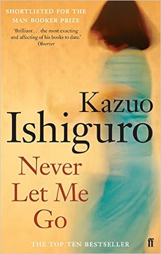
HONESTLY, this looks like a Nicholas Sparks book cover...

HAHAHAHHA... for REAL though!?? Yeahhh, that's why I just got straight romance vibes from this cover. I would honestly see this book at Barnes and Noble and without even looking at the text on it say... "Oh shoot! Another one!? Wonder if they're gonna make another movie based off of this new one!?" Anyways, I feel like this cover matches the idea in the book of isolationism for the kids, however, I don't get too much more from it besides some eery undertones from a solitary boat being in a stagnant lake. This could be a metaphor for the children's inability to move forward in life. These kids are kept in these places like Hailsham and The Cottages for their entire childhood and have the opportunity to run away but never do so, for fear of the unknown/what's in the real world. This image is a metaphor for this because it's an island and the inhabitants could leave but they probably choose not to, as there is a vast lake/ocean/marina (-->who knows?) in front of them that is foreboding and maybe uncharted and dangerous so they choose to stay on the "safe" land. It's the idea that the unknown/the outside world is scary and in the book the kids come up with their own ways to keep themselves in (ex. scaring each other about the Hailsham woods) when in fact, according to the metaphor on the cover, "there is a boat" and technically they could leave/escape if they wanted to, but it's themselves and that fear that holds them back. This all falls under our flaw as humans to stay in our comfort zones. "We like what we know", this is a fact, however, this is also the reason that humans do not advance and Ishiguro plays off this tragic flaw big time in the story. Someone may be misled at first when they look at this cover, however, once they analyze the book heavily they may be able to make some connections similar to mine about the cover's connection to the plot. It's for sure one that you have to look deep into in order to find some connections.
I think that these 2 covers fit the story best. They are completely opposite in the sense of the tone they portray with one being more eery/dark and the other seeming to be more bright and vibrant/joyful however they both still comment on the flaws of mankind and the purpose of human lives. The dark one is supposed to be criticizing our potential for our loss of humanity, while the bright one is criticizing our habit to categorize people and how people can lose their individualism once they are oppressed and manipulated into doing something or being someone they are not. The one on the right is also commenting on children's' impressionability when they are young and how as they grow up they are always changing their identities based on their environments and the people around them;(just as the kids at Hailsham do). This is why the figure looks almost as if it is being erased because it is constantly being reshaped. They both follow the idea that these kids are obviously not their own people and being used for something more. The dark one makes this idea clear as the organs are clearly the focal point. Going off of this, they both show unwhole figures which reinforces this idea of being incomplete that is present in the kids of the book. I think that if someone picked up either of these covers that they'd find them to be a pretty accurate representation of the story they hold.
Hey Shea!
ReplyDeleteI'm pumped to hear from you when we do Gatsby in March! You'll be the expert. You do a really nice job of leading your reader through your argument and analysis, but I do wish there was a bit more SPECIFIC and DIRECT analysis and comparison of the two covers- it gets a bit rushed at the end. Think about it like a Paper 1...what would you analyze and discuss?
See below for further feedback from the blog post rubric.
- Postings provide comprehensive insight, understanding, and reflective thought about the topic (4)
- Postings present a specific viewpoint that is substantiated by supporting examples (3)
- Postings are generally well written with some attempts made to stimulate dialogue and commentary (3)
- Postings are written in a style that is appealing and appropriate for the intended audience and a consistent voice is evident throughout (4)
- Postings reflect a bit of the author’s personality through word choices that attempt to bring the topic to life (3)
- All images, media and text created by others display appropriate copyright permissions and accurate citations (4)
- Written responses are largely free of grammatical, spelling or punctuation errors. The style of writing generally facilitates communication (3)
24/28
I really liked how you started off your blog with a personal connection to how you look at what books you want to read. I think that this was a great way to engage your readers. The interpretation of the first cover and how it represents the children are struggling to find their identities is very interesting and unique way of looking at it. When I did this I thought it was of Kathy dancing. For the third cover I interpreted it in the same way saying that it represented the story of the novel very well with the depiction of the organs encompassed by barbed wire.
ReplyDelete